
The Pattern Principle
Patterns in Caillebotte and Poliakoff

Recently, I read “The Pleasures of Patterns in Art” by Samuel Jay Keyser, a theoretical linguist at MIT. This essay, adapted from Keyser’s book Play It Again, Sam: Repetition in the Arts, is an engrossing mix of art appreciation, art history, and visual theory—an unbeatable combination for an art critic and designer.
Keyser opens by writing about how repetition and variation work in Gustave Caillebotte’s Paris Street, Rainy Day (1877). You don’t have to have a degree from MIT to figure out why this painting is great—that is patently obvious. Caillebotte could paint interiors and exteriors, country gardens and Parisian vistas; my favorites are his paintings of crews refinishing the hardwood floors of a Paris flat. He was considered an Impressionist but, unlike some of his peers, Caillebotte aimed for psychological realism, depicting modern life through snapshots of intimate moments with distinctly individual protagonists.
Paris Street, Rainy Day is replete with what Keyser calls “visual rhymes”: the slippery cobblestones underfoot, the black-clad figures and their bobbing umbrellas, the repetitive architectural features of Haussmann-era buildings and the receding perspectives of the boulevards. It is also easy to transfer these visual rhymes to aural ones: the continual, but varying patter of raindrops striking pavement and fabric, the sound of carriage wheels and hooves, people chatting.
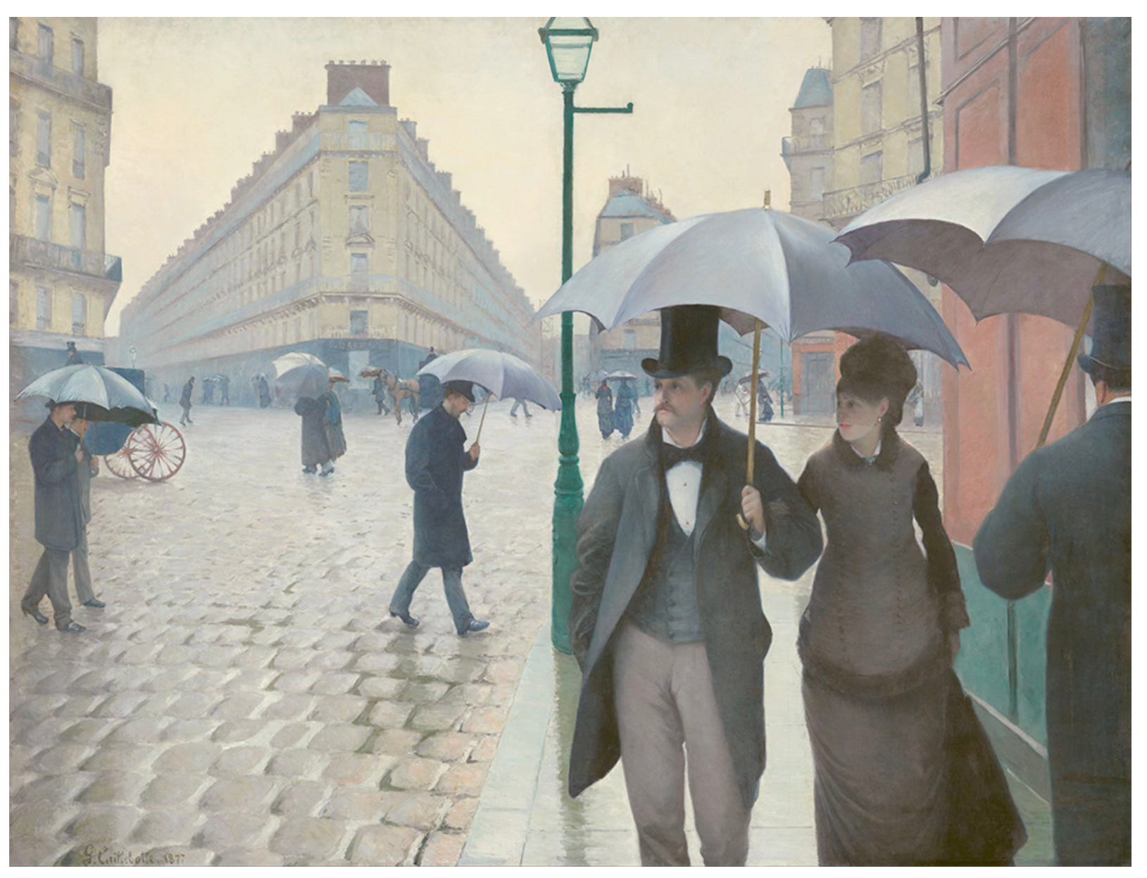
As so often happens with Caillebotte, the viewer becomes part of the scene. Here, we are dropped into the middle of the sidewalk on a collision course with the fashionable couple in straight ahead. I am distracted: he is handsome and she is pretty. It is awkward: The sidewalk is narrow and our umbrellas could become tangled. It is wet and breezy, cool, if not cold. Maybe the man at the far right has just jostled me in passing and I am in danger of falling off the sidewalk into the path of a passing carriage. What if I run into that street lamp? That would be the same street lamp that Keyser says would have been long gone from Paris at this time but one the painter inserted to create depth.
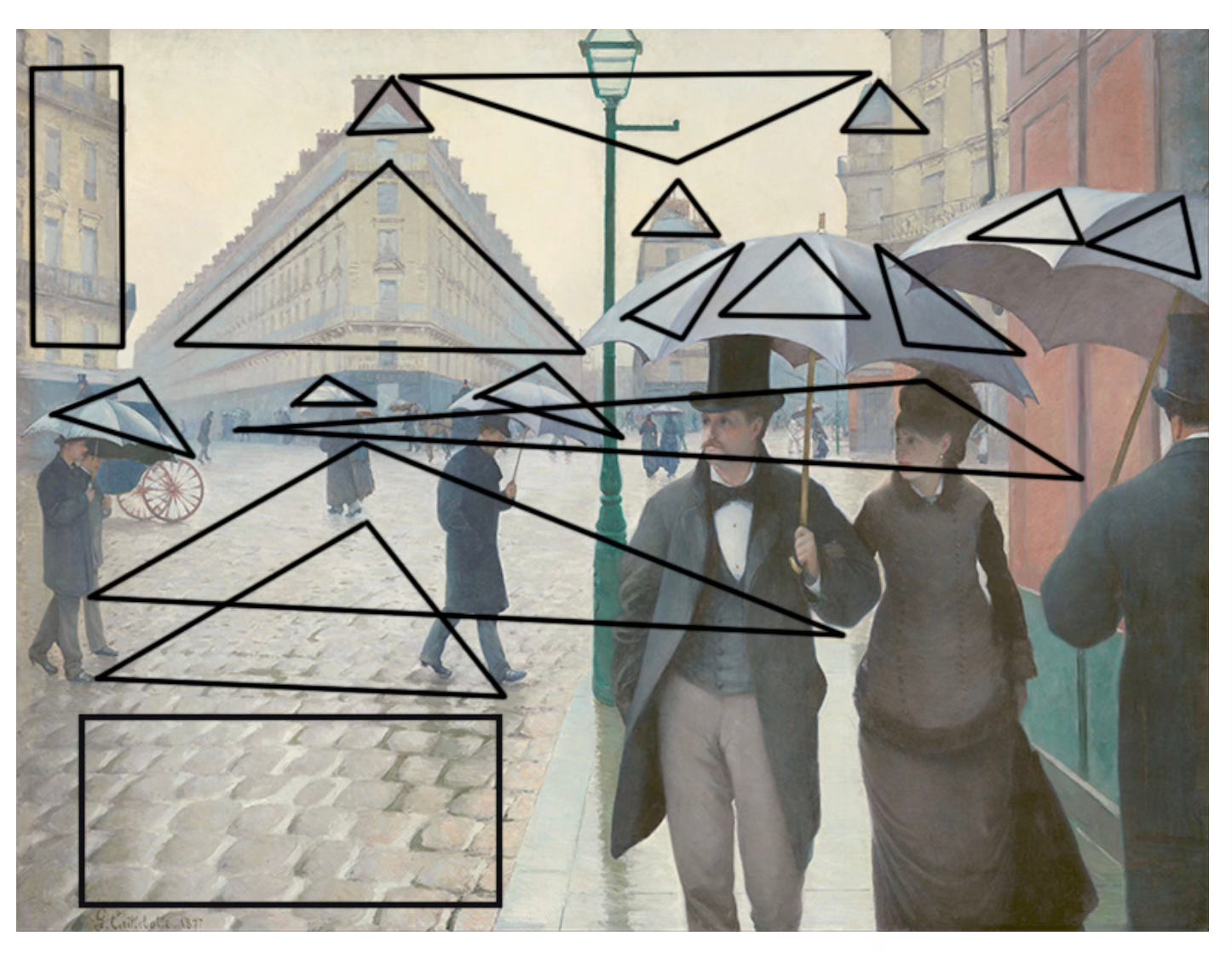
Keyser delights in pointing out how “the interplay between repetition and variation is central to how we perceive structure, rhythm, and depth across mediums.” He illustrates this by outlining all the triangles that appear in Caillebotte’s painting. Quite a few as it happens. These triangles are not only trios of repeated motifs (umbrella sections) but also triangular shapes employed to create depth and realism (receding perspective, architectural elements). These, Keyser contends, provide a visual structure that builds the image technically even as it fills in our perception of it.
Keyser further cites psychological insights such as how pleasurable we human beings find repetitions to be. One need only consider how repetitions and patterns function across artforms such as poetry, song, instrumental music, photography, architecture, and—as Keyser and, before him, Roland Barthes, show—advertising. He calls on theoretical reinforcements from Kant to Derrida. His lengthy analysis of Lee Friedlander’s 1972 photograph Albuquerque, New Mexico is inspired, especially when Keyser tracks the photograph’s “same/except repetition,” that is, when an artist uses recurring elements that look the same but differ slightly with each iteration. This dynamic tends to move the eye around an image, changing the focal point, and forcing us to work a little harder to make sense of what we are seeing. When we note similarities and differences in a work of art, when we consider what is central and what is peripheral, we are bringing a unique act of interpretation to bear on the image—we are making meaning as only we can make it.
Although this would be the subject of a much larger discussion, the same/except principle also operates in realism versus surrealism. With realism, similarities and differences exist and are perceived and are accepted by the brain as how things appear in the world. Surrealism, on the other hand, also toggles between similarities and differences of perception, but the brain is baffled (Dalí’s melting watches) or lulled (Di Chirico’s enthralling but vaguely menacing vistas). With surrealism, perception occurs perhaps uneasily and understanding tenuous or not at all.
Visual Rhymes in Abstract Art
So let’s take Keyser’s exercise and try it on a work of art that is not representational. Russian-French modernist Serge Poliakoff (1900–1969) is an artist whom I admire for his vibrant sense of color, his bold compositions, and his willingness to allow the hand of the artist to show in the midst of hard-edged abstraction. His Composition from 1950 is classic Poliakoff: luscious orange, scarlet, and mustard yellows with black and white in irregular shapes, hints of outlines, and lots of brushy paint strokes. It is energetic and dynamic—an exciting object to contemplate. What is it? It is first a painting, something the artist created out of his imagination. Its foremost characteristic is its created nature. It does not represent any known thing in the world although it contains intimations of many things we recognize: fruit, sunshine, ice, black night, a jumble of buildings. It might be many things and yet it is none of them.
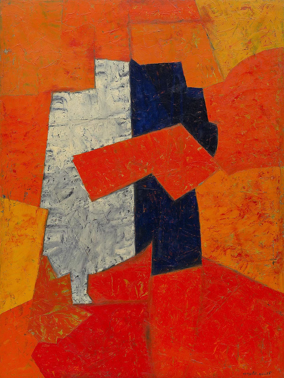
To continue with the same/except exercise: The white and black shapes at the center vaguely suggest two halves of a whole but they are not mirror images. Poliakoff hasn’t even rendered either half in pure tones. The dark half is more like blue-black-violet with specks of orange (probably from an underlayer). The white half is more gray than anything else, perhaps even yellowing a bit as the pigment has changed over time. (I have read many times about the influence of the jewel-tone palette of Russian Orthodox iconography on Poliakoff’s work.) Surrounding the central motif is an array of contiguous shapes. These peripheral shapes all share at least one border except for that big red arrow head at the center which touches red on the right but floats in white on the left.
And what about the blocks that Poliakoff has assembled? They fit together like a puzzle but each is unique in shape; not like a conventional jigsaw puzzle in which most of the pieces look similar (except for border pieces). Poliakoff had the uncanny ability to block out his compositions in advance without losing a sense of dynamism. We can assume that the hints of dark lines indicate a preliminary sketch, but we shouldn’t dismiss the possibility that Poliakoff disregarded his sketch at various points and improvised in paint. I have tried numerous times to create a Poliakoff homage and it is much more difficult than it looks.
Remember how Keyser observed that Caillebotte built Paris Street, Rainy Day through a series of triangles? Triangles could be imposed on the Poliakoff but that just seems too pat; to me, the composition is built up instead with parallel and intersecting lines. Triangles are rigid and finite; they may be made up of different angles, but there are always only three lines that must meet. Parallel and intersecting lines allow for much more serendipity and play.
Last, let’s apply Keyser’s “visual rhymes” to the Poliakoff. In addition to the same/except repetitions mentioned above, the visual rhymes here arise from the evidence of the act of painting left behind by the artist: The intimation of a sketch, the building-up of layers of color, the intuitive use of color, and the surface with its thicket of brush strokes and melding layers. Serenity and calmness are not hallmarks of Poliakoff’s art although he did make many terrific monochromatic works which call for close, quiet study. In Composition, however, Poliakoff presents stolid shapes enlivened by rich color. His surface is worked and broken yet it presents a coherence due to the all-over brushwork. The visual rhymes are more like counterpoint: whitish shades contrasting with blackish shades, the progression of warm red in all its varieties. Speaking of red—a problematic color as any painter will tell you—Poliakoff was fearless in its use throughout his art. In Composition, he offers a range of treatments using this tricky color: an almost uninflected red, flicks of red across orange or yellow, and scarlet barely covering an ochre underlayer.
I don’t believe that Caillebotte intentionally structured his painting around triangles—nor do I think Keyser is saying this. And I don’t believe that Poliakoff deliberately employed a point/counterpoint process in his Composition. Artists as accomplished as Caillebotte and Poliakoff had, over the course of their careers, assimilated the various elements of art as a kind of language. Their imaginative expression employed a vocabulary purified by years of refinement and innate talent. I see theories such as Keyser’s as entertaining exercises in dissecting what is pleasurable in the perception of art. This is not a frivolous or trivial thing. Not only can these discussions shed new light on old favorites, they can also open up art that confounds. That is the best corollary of the Pattern Principle.